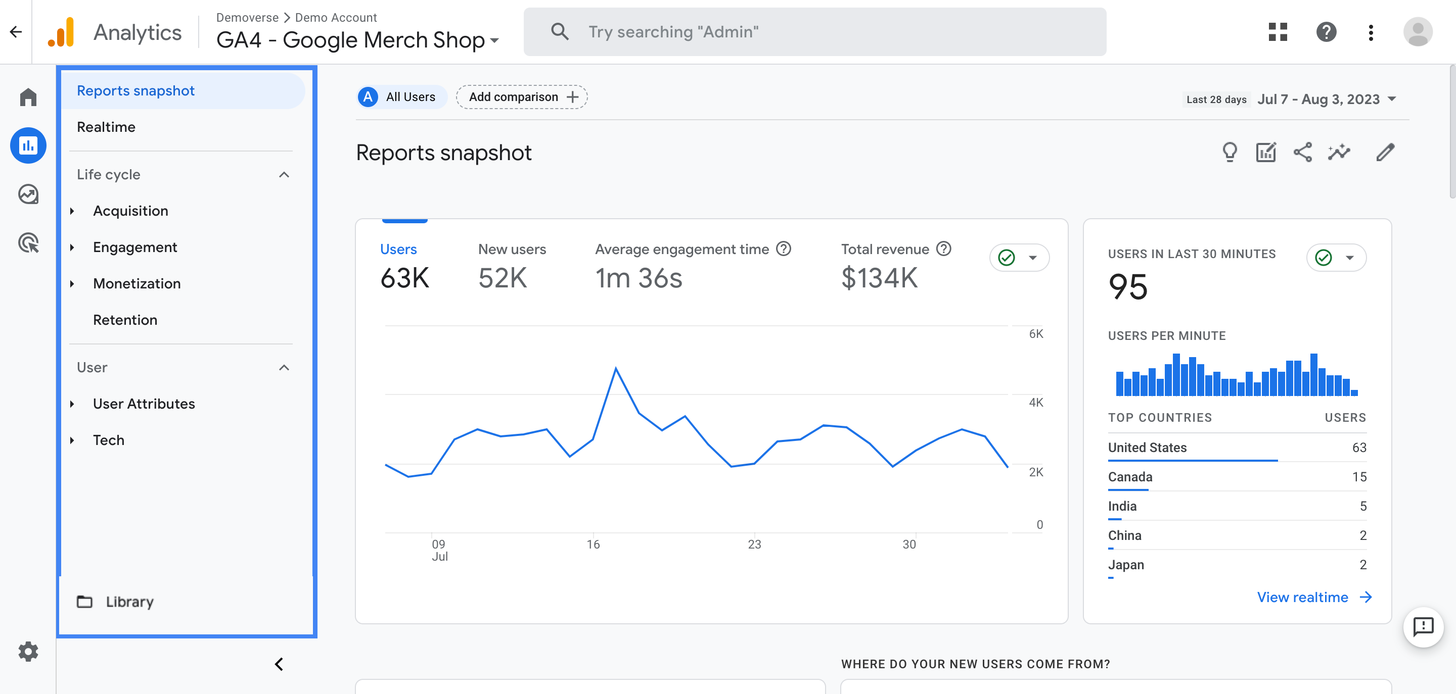
I’ve been using Google Analytics way before it was the sleek, data-driven platform it is today. From the days of Urchin to the evolution of Universal Analytics, and now with Google Analytics 4 (GA4), I’ve seen firsthand how web analytics has transformed. One of the features I find incredibly valuable, especially for my e-commerce projects, is the power of custom reports.
The Evolution of Google Analytics: A Timeline
Urchin (Early 2000s)
The grandfather of web analytics. Laid the foundation for website tracking.
Google Analytics (Classic) (2005)
Acquired Urchin and transformed it into a user-friendly free platform, making analytics accessible to the masses. Introduced pageviews, unique visitors, etc.
Universal Analytics (2012)
Focused on a user-centric approach to track across multiple devices and platforms. Introduced User IDs, Custom Dimensions & Metrics, and a more robust reporting interface.
Google Analytics 4 (2020)
Built for a privacy-focused future, designed to work across websites and apps, using machine learning for deeper insights and predictive capabilities. Embraces event-based tracking.
Why Custom Reports Matter for E-commerce Success
GA4’s default reports are great for getting a general overview of your website’s performance. However, as your e-commerce business grows and becomes more sophisticated, your data analysis needs evolve as well. Custom reports give you that critical ability to deep-dive into your website data, answer your most pressing questions, and uncover opportunities you might otherwise miss.
For instance, do you want to track how users who discover your site through specific social media campaigns behave differently than users from organic search? Are you looking for ways to understand which product categories resonate most with your high-value customers? These are the types of insights that you can unlock with custom reports in GA4. Here’s how they benefit you:
- Granular Insights: Go beyond pre-defined metrics and tailor your data exploration to examine specific areas relevant to your e-commerce strategy.
- Measure Key Performance Indicators (KPIs): Align your data analysis with your unique business goals. Want to track revenue by product color or shipping method? No problem! Custom reports let you focus on the data that truly matters to your bottom line.
- Improve Marketing ROI: Analyze the performance of your various marketing efforts to determine what’s driving the most valuable conversions and revenue.
- Optimized Decision-Making: By leveraging data from your custom reports, you’re empowered to make more informed choices across your marketing campaigns, website merchandising, inventory management, and overall customer experience.
Step 1: Setting Up Essential E-commerce Events
Before creating powerful custom reports, you’ll need to lay the groundwork. This involves tracking specific events within GA4. The good news is that Google has already predefined a set of very useful e-commerce events to help you analyze how users interact with your products. It’s just a matter of setting them up correctly.
- view_itemTriggered when a user views a product detail page
- add_to_cartTriggered when a user adds a product to their shopping cart
- begin_checkoutTriggered when a user starts the checkout process
- purchaseTriggered when a user completes a purchase
These events provide rich information about each step of your customers’ journeys within your store. With proper event tracking, you gain a deep understanding of how effectively you’re converting visitors into paying customers and where drop-off points exist in the funnel.
How to Set Up These Events:
The easiest way to implement these e-commerce events is through Google Tag Manager. You can refer to Google’s official documentation for step-by-step instructions on how to create and manage GA4 e-commerce tags using GTM. You’ll essentially define when and how these events should fire based on actions within your e-commerce store.
GA4 E-commerce Event Setup Documentation
Step 2: Navigating to the Explore Section
GA4 offers different ways to build custom reports. The most versatile area is the Explore section. Think of it as your visual data playground. In the Explore interface, you’ll find an extensive collection of reports, templates, and visualization options. The best way to approach this is to familiarize yourself with the layout.
- Log in to your Google Analytics 4 (GA4) property.
- In the left navigation menu, look for and click on ‘Explore’.
- This will open up the report gallery, which is filled with a diverse collection of report types, starting from empty canvas types to prebuilt explorations ready for editing or just browsing through for ideas.
- For complete custom reports from the scratch, Click on the ‘Blank’ template option. As implied, it starts you with an empty canvas so you have full control and customization.
Step 3: Building your custom e-commerce report
- Name your Report: Begin by giving your report a descriptive and meaningful title. Doing so allows you to organize all the custom reports that you may have in the Explore hub of Google Analytics
- Introduce Dimensions: In the “Variables” tab on the right, locate the “Dimensions” menu item. Dimensions, in layman terms, provide the descriptive labels for the data you want to view, be it page URL, product category, device type, or traffic sources.
- Select Metrics: Similarly, identify your metrics from the same “Variables” menu by selecting the “Metrics” item. The goal of selecting metrics is that they are what you wish to measure in relation to the dimensions you chose. Do you want to know page views or transactions on your product detail page for your mobile visitors, well both of those “what” is measured as a metric, where the later would be calculated from event data.
Step 4: Filtering and Segmenting your data for granularity
Now, let’s move towards filtering and segmenting the data in your report. Often, in web analysis, we don’t need the whole dataset available to answer our core question and understand the trend that matters.
In Google Analytics 4’s explore tab, you can use filters and segments to remove unwanted or superfluous data. It is crucial to know that Filters are used to narrow down your custom report on a data level, by applying preconditions to the included dimension’s attributes, effectively modifying it directly, while segments can be utilized to group data and make comparisons without editing your report data directly.
Examples: Segment: Only users coming from Germany vs. Filter: only page dimension matching ‘/about’
So segments empower you to zoom in on particular groups of visitors for laser-focused insights.
For example, I love building custom reports with segments like:
- New vs. Returning Customers
- Purchasers vs. Non-purchasers
- High-value customers (users who generate high order values)
- Mobile vs. Desktop Users
- Customers from specific ad campaigns
How to Apply Filters & Segments:
- Click on the + tab below “Tabs”
- Pick “Add Segment”, then either add it to your analysis by dragging from the top to the segment field, or add an entirely new one via clicking on “+ New segment”. Here you can apply user filters and a conditions menu as desired. Google Analytics provides example segments in the drop-down if you are looking for inspiration
- For “Filtering”, you would select the dimensions “pencil” logo, or by dragging them in the tab item field called “Filters” (below segments tab). Then, from the new menu you are provided, either select from default filter lists (for example event attributes from GA), or enter regex or substring search for each.
Step 5: Selecting the best data visualization
Your hard-won insights don’t do anyone much good if they’re just hiding in columns of data. Now it’s time to bring your insights to life through appropriate and meaningful visualizations!
In the ‘Tab Settings’ tab on the right side of the screen you’ll find the “Technique” selector, providing various visual tools including line charts, tables, scatter charts, bar graphs, etc. There is no right answer in the end on what you’d choose, instead it depends on your purpose and understanding the strengths of each for storytelling with data: For example:
- Tables are excellent for deep-dives into the raw figures. They show specific breakdowns of metrics within selected segments or dimension levels (e.g. see transaction and revenue values by landing page performance)
- Line charts: Show the trend and pattern development for metrics, ideal for displaying changes across dimensions over time (e.g. organic traffic by months)
- Bar charts provide effective visual comparisons of the quantities of selected dimension groups. For example, when you compare order values from first-time buyers versus returning shoppers
- Pie charts: Good for seeing proportions (e.g. Percentage of users completing purchases with Desktop vs. mobile).
Interactive Demo: Building a Product Performance Report
Report Configuration
- Dimensions: Item name, Source / Medium
- Metrics: Total revenue, Transactions, Avg. order value
- Segment: Returning Customers
Click “Visualization” to see the resulting chart!
Product Performance Visualization
Key Insights
- Product B is the top performer in terms of revenue and transactions
- Product C has the highest average order value
- Product E might need a marketing push or reconsideration in the product lineup
These insights can help inform inventory decisions, marketing strategies, and product development!
Infographic: GA4 Custom Reports for E-commerce Success
I’m Offering Unique Solutions for Your E-commerce Growth!
Navigating the world of data can be overwhelming, and taking action to fully leverage that data takes time, specialized knowledge, and expertise. If you’re serious about boosting your e-commerce results, I can provide tailored solutions that streamline your processes, drive conversions, and amplify your online sales.


